/* [Master Stylesheet - v1.0] */
/* =========== Index of CSS ===========
:: 1.0 Import Fonts
:: 2.0 Import All CSS
:: 3.0 Base CSS
    :: 3.1.0 Spacing
    :: 3.2.0 Height
    :: 3.3.0 Section Padding
    :: 3.4.0 Section Heading
    :: 3.5.0 Preloader CSS
    :: 3.6.0 Miscellaneous
    :: 3.7.0 ScrollUp
    :: 3.8.0 Palatin Button
:: 4.0 Header Area CSS
:: 5.0 Hero Area CSS
:: 6.0 Book Now Area CSS
:: 7.0 About Us Area CSS
:: 8.0 Pool Area CSS
:: 9.0 Rooms Area CSS
:: 10.0 Services Area CSS
:: 11.0 Our Hotel Area CSS
:: 12.0 Testimonial Area CSS
:: 13.0 Footer Area CSS
:: 14.0 Breadcumb Area CSS
:: 15.0 Blog Area CSS
:: 16.0 Contact Area CSS
:: 17.0 Skills Area CSS
:: 18.0 Elements Area CSS
    :: 18.1.0 Single Cool Facts CSS
    :: 18.2.0 Accordians Area CSS
    :: 18.3.0 Tabs Area CSS
*/
/* :: 1.0 Import Fonts */
@import url(css/bootstrap.min.css);
@import url(css/classy-nav.css);
@import url(css/owl.carousel.min.css);
@import url(css/animate.css);
@import url(css/magnific-popup.css);
@import url(css/font-awesome.min.css);
@import url(css/nice-select.css);
@import url(css/travel-icon.css);
@font-face {
  font-family: 'FuturaLT-Book';
  src: url("fonts/FuturaLT-Book.eot?#iefix") format("embedded-opentype"), url("fonts/FuturaLT-Book.woff") format("woff"), url("fonts/FuturaLT-Book.ttf") format("truetype"), url("fonts/FuturaLT-Book.svg#FuturaLT-Book") format("svg");
  font-weight: normal;
  font-style: normal; }
/* :: 2.0 Import All CSS */
/* :: 3.0 Base CSS */
* {
  margin: 0;
  padding: 0; }

body {
  font-family: "FuturaLT-Book";
  font-size: 14px; }

h1,
h2,
h3,
h4,
h5,
h6 {
  color: #363636;
  line-height: 1.3;
  font-weight: 400; }

p {
  color: #7d7d7d;
  font-size: 14px;
  line-height: 2.1;
  font-weight: 400; }

a,
a:hover,
a:focus {
  -webkit-transition-duration: 500ms;
  transition-duration: 500ms;
  text-decoration: none;
  outline: 0 solid transparent;
  color: #141414;
  font-weight: 400;
  font-size: 14px; }

ul,
ol {
  margin: 0; }
  ul li,
  ol li {
    list-style: none; }

img {
  height: auto;
  max-width: 100%; }

/* :: 3.1.0 Spacing */
.mt-15 {
  margin-top: 15px !important; }

.mt-30 {
  margin-top: 30px !important; }

.mt-50 {
  margin-top: 50px !important; }

.mt-70 {
  margin-top: 70px !important; }

.mt-100 {
  margin-top: 100px !important; }

.mb-15 {
  margin-bottom: 15px !important; }

.mb-30 {
  margin-bottom: 30px !important; }

.mb-50 {
  margin-bottom: 50px !important; }

.mb-70 {
  margin-bottom: 70px !important; }

.mb-100 {
  margin-bottom: 100px !important; }

.ml-15 {
  margin-left: 15px !important; }

.ml-30 {
  margin-left: 30px !important; }

.ml-50 {
  margin-left: 50px !important; }

.mr-15 {
  margin-right: 15px !important; }

.mr-30 {
  margin-right: 30px !important; }

.mr-50 {
  margin-right: 50px !important; }

/* :: 3.2.0 Height */
.height-400 {
  height: 400px !important; }

.height-500 {
  height: 500px !important; }

.height-600 {
  height: 600px !important; }

.height-700 {
  height: 700px !important; }

.height-800 {
  height: 800px !important; }

/* :: 3.3.0 Section Padding */
.section-padding-100 {
  padding-top: 100px;
  padding-bottom: 100px; }

.section-padding-100-0 {
  padding-top: 100px;
  padding-bottom: 0; }

.section-padding-0-100 {
  padding-top: 0;
  padding-bottom: 100px; }

.section-padding-100-70 {
  padding-top: 100px;
  padding-bottom: 70px; }

/* :: 3.4.0 Section Heading */
.section-heading {
  position: relative;
  z-index: 1;
  margin-bottom: 60px; }
  .section-heading .line- {
    width: 90px;
    height: 2px;
    background-color: #006582;
    display: block;
    margin-bottom: 40px; }
  .section-heading h2 {
    font-size: 48px;
    color: #363636; }
    @media only screen and (min-width: 992px) and (max-width: 1199px) {
      .section-heading h2 {
        font-size: 40px; } }
    @media only screen and (min-width: 768px) and (max-width: 991px) {
      .section-heading h2 {
        font-size: 36px; } }
    @media only screen and (max-width: 767px) {
      .section-heading h2 {
        font-size: 24px; } }
  .section-heading p {
    margin-bottom: 0; }
  .section-heading.text-center .line- {
    margin: 0 auto 40px; }
  .section-heading.white h2,
  .section-heading.white p {
    color: #ffffff; }

/* :: 3.5.0 Preloader CSS */
.preloader {
  background-color: #ffffff;
  width: 100%;
  height: 100%;
  position: fixed;
  top: 0;
  left: 0;
  right: 0;
  z-index: 9999; }
  .preloader .cssload-container {
    display: block;
    width: 97px; }
  .preloader .cssload-loading i {
    width: 19px;
    height: 19px;
    display: inline-block;
    border-radius: 50%;
    background: #cb8670; }
  .preloader .cssload-loading i:first-child {
    opacity: 0;
    animation: cssload-loading-ani2 0.58s linear infinite;
    -o-animation: cssload-loading-ani2 0.58s linear infinite;
    -ms-animation: cssload-loading-ani2 0.58s linear infinite;
    -webkit-animation: cssload-loading-ani2 0.58s linear infinite;
    -moz-animation: cssload-loading-ani2 0.58s linear infinite;
    transform: translate(-19px);
    -o-transform: translate(-19px);
    -ms-transform: translate(-19px);
    -webkit-transform: translate(-19px);
    -moz-transform: translate(-19px); }
  .preloader .cssload-loading i:nth-child(2),
  .preloader .cssload-loading i:nth-child(3) {
    animation: cssload-loading-ani3 0.58s linear infinite;
    -o-animation: cssload-loading-ani3 0.58s linear infinite;
    -ms-animation: cssload-loading-ani3 0.58s linear infinite;
    -webkit-animation: cssload-loading-ani3 0.58s linear infinite;
    -moz-animation: cssload-loading-ani3 0.58s linear infinite; }
  .preloader .cssload-loading i:last-child {
    animation: cssload-loading-ani1 0.58s linear infinite;
    -o-animation: cssload-loading-ani1 0.58s linear infinite;
    -ms-animation: cssload-loading-ani1 0.58s linear infinite;
    -webkit-animation: cssload-loading-ani1 0.58s linear infinite;
    -moz-animation: cssload-loading-ani1 0.58s linear infinite; }
@keyframes cssload-loading-ani1 {
  100% {
    transform: translate(39px);
    opacity: 0; } }
@-o-keyframes cssload-loading-ani1 {
  100% {
    -o-transform: translate(39px);
    opacity: 0; } }
@-ms-keyframes cssload-loading-ani1 {
  100% {
    -ms-transform: translate(39px);
    opacity: 0; } }
@-webkit-keyframes cssload-loading-ani1 {
  100% {
    -webkit-transform: translate(39px);
    opacity: 0; } }
@-moz-keyframes cssload-loading-ani1 {
  100% {
    -moz-transform: translate(39px);
    opacity: 0; } }
@keyframes cssload-loading-ani2 {
  100% {
    transform: translate(19px);
    opacity: 1; } }
@-o-keyframes cssload-loading-ani2 {
  100% {
    -o-transform: translate(19px);
    opacity: 1; } }
@-ms-keyframes cssload-loading-ani2 {
  100% {
    -ms-transform: translate(19px);
    opacity: 1; } }
@-webkit-keyframes cssload-loading-ani2 {
  100% {
    -webkit-transform: translate(19px);
    opacity: 1; } }
@-moz-keyframes cssload-loading-ani2 {
  100% {
    -moz-transform: translate(19px);
    opacity: 1; } }
@keyframes cssload-loading-ani3 {
  100% {
    transform: translate(19px); } }
@-o-keyframes cssload-loading-ani3 {
  100% {
    -o-transform: translate(19px); } }
@-ms-keyframes cssload-loading-ani3 {
  100% {
    -ms-transform: translate(19px); } }
@-webkit-keyframes cssload-loading-ani3 {
  100% {
    -webkit-transform: translate(19px); } }
@-moz-keyframes cssload-loading-ani3 {
  100% {
    -moz-transform: translate(19px); } }
/* :: 3.6.0 Miscellaneous */
.bg-img {
  background-position: center center;
  background-size: cover;
  background-repeat: no-repeat; }

.bg-white {
  background-color: #ffffff !important; }

.bg-dark {
  background-color: #000000 !important; }

.bg-transparent {
  background-color: transparent !important; }

.font-bold {
  font-weight: 700; }

.font-light {
  font-weight: 300; }

.bg-overlay {
  position: relative;
  z-index: 2;
  background-position: center center;
  background-size: cover; }
  .bg-overlay::after {
    background-color: rgba(0, 0, 0, 0.63);
    position: absolute;
    z-index: -1;
    top: 0;
    left: 0;
    width: 100%;
    height: 100%;
    content: ""; }

.bg-fixed {
  background-attachment: fixed !important; }

/* :: 3.7.0 ScrollUp */
#scrollUp {
  background-color: #cb8670;
  border-radius: 0;
  bottom: 50px;
  box-shadow: 0 2px 6px 0 rgba(0, 0, 0, 0.3);
  color: #ffffff;
  font-size: 24px;
  height: 40px;
  line-height: 40px;
  right: 50px;
  text-align: center;
  width: 40px;
  -webkit-transition-duration: 500ms;
  transition-duration: 500ms; }
  #scrollUp:hover, #scrollUp:focus {
    background-color: #363636; }

/* :: 3.8.0 Palatin Button */
.tiktok-icon {
    width: 20px;
    height: 20px;
    margin-right: 20px;
}
.palatin-btn {
  background-color: #363636;
  -webkit-transition-duration: 500ms;
  transition-duration: 500ms;
  position: relative;
  z-index: 1;
  display: inline-block;
  min-width: 123px;#363636
  height: 53px;
  color: #ffffff;
  border: none;
  border-radius: 0;
  padding: 0 30px;
  font-size: 16px;
  line-height: 53px;
  text-transform: capitalize; }
  .palatin-btn:hover, .palatin-btn:focus {
    font-size: 16px;
    background-color: #363636;
    color: #ffffff; }
  .palatin-btn.btn-2 {
    background-color: #363636;
    color: #ffffff; }
    .palatin-btn.btn-2:hover, .palatin-btn.btn-2:focus {
      font-size: 16px;
      background-color: #cb8670;
      color: #ffffff; }
  .palatin-btn.btn-3 {
    background-color: #ffffff;
    color: #cb8670;
    border: 2px solid #cb8670;
    height: 49px;
    line-height: 48px; }
    .palatin-btn.btn-3:hover, .palatin-btn.btn-3:focus {
      font-size: 16px;
      background-color: #000000;
      color: #ffffff; }

/* :: 4.0 Header Area CSS */
.social-icons i {
    color: #000000; /* or #000 if your background is white */
    font-size: 24px;
}
.social-icons i {
    color: #fff; /* or #000 if your background is white */
    font-size: 24px;
}
.header-area {
  position: absolute;
  z-index: 100;
  width: 100%;
  top: 0;
  left: 0;
  z-index: 1000; }
  .header-area .palatin-main-menu {
    position: relative;
    width: 100%;
    background-color: rgba(0, 0, 0, 0.63);
    border-bottom: 2px solid rgba(203, 134, 112, 0.63); }
    .header-area .palatin-main-menu .classy-nav-container {
     background-color: rgb(0, 0, 0);
    }
    .header-area .palatin-main-menu .classy-navbar {
      -webkit-transition-duration: 300ms;
      transition-duration: 300ms;
      background-color: transparent;
      height: 150px;
      padding: 0; }
      @media only screen and (max-width: 767px) {
        .header-area .palatin-main-menu .classy-navbar {
          height: 70px; } }
      @media only screen and (min-width: 992px) and (max-width: 1199px) {
        .header-area .palatin-main-menu .classy-navbar .nav-brand {
          max-width: 140px; } }
      @media only screen and (max-width: 767px) {
        .header-area .palatin-main-menu .classy-navbar .nav-brand {
          max-width: 140px; } }
      .header-area .palatin-main-menu .classy-navbar .classynav ul li a {
        text-transform: capitalize;
        color: #ffffff;
        font-size: 16px;
        background-color: transparent; }
       
        @media only screen and (min-width: 992px) and (max-width: 1199px) {
          .header-area .palatin-main-menu .classy-navbar .classynav ul li a {
            font-size: 14px; } }
        @media only screen and (min-width: 768px) and (max-width: 991px) {
          .header-area .palatin-main-menu .classy-navbar .classynav ul li a {
            background-color: #6c6c6c; } }
        @media only screen and (max-width: 767px) {
          .header-area .palatin-main-menu .classy-navbar .classynav ul li a {
            background-color: #6c6c6c; } }
      .header-area .palatin-main-menu .classy-navbar .classynav ul li.active a {
        color: #ffffff;
        background-color: #6c6c6c; }
      .header-area .palatin-main-menu .classy-navbar .classynav ul li.megamenu-item > a::after,
      .header-area .palatin-main-menu .classy-navbar .classynav ul li.has-down > a::after {
        color: #ffffff; }
      .header-area .palatin-main-menu .classy-navbar .classynav ul li ul li a {
        color: #363636; }
        @media only screen and (min-width: 992px) and (max-width: 1199px) {
          .header-area .palatin-main-menu .classy-navbar .classynav ul li ul li a {
            padding: 0 20px; } }
        @media only screen and (min-width: 768px) and (max-width: 991px) {
          .header-area .palatin-main-menu .classy-navbar .classynav ul li ul li a {
            color: #ffffff; } }
        @media only screen and (max-width: 767px) {
          .header-area .palatin-main-menu .classy-navbar .classynav ul li ul li a {
            color: #ffffff; } }
      .header-area .palatin-main-menu .classy-navbar .menu-btn {
        margin-left: 100px; }
        @media only screen and (min-width: 992px) and (max-width: 1199px) {
          .header-area .palatin-main-menu .classy-navbar .menu-btn {
            margin-left: 30px; } }
        @media only screen and (min-width: 768px) and (max-width: 991px) {
          .header-area .palatin-main-menu .classy-navbar .menu-btn {
            margin-left: 30px;
            border: 2px solid #ffffff;
            margin-top: 30px;
            display: inline-block; } }
        @media only screen and (max-width: 767px) {
          .header-area .palatin-main-menu .classy-navbar .menu-btn {
            margin-left: 30px;
            border: 2px solid #ffffff;
            margin-top: 30px;
            display: inline-block; } }
        .header-area .palatin-main-menu .classy-navbar .menu-btn a {
          color: #ffffff;
          font-size: 16px; }
  .header-area .is-sticky .palatin-main-menu {
    position: fixed;
    width: 100%;
    top: 0;
    left: 0;
    z-index: 9999;
    background-color: #000;
    box-shadow: 0 5px 50px 15px rgba(0, 0, 0, 0.2); }
    .header-area .is-sticky .palatin-main-menu .classy-navbar {
      height: 90px; }
      @media only screen and (max-width: 767px) {
        .header-area .is-sticky .palatin-main-menu .classy-navbar {
          height: 70px; } }

@media only screen and (min-width: 768px) and (max-width: 991px) {
  .breakpoint-on .classy-navbar .classy-menu {
    background-color: #030303; } }
@media only screen and (max-width: 767px) {
  .breakpoint-on .classy-navbar .classy-menu {
     transition-duration: 300ms;
      background-color: transparent;
    background-color: #030303;
    } }

@media only screen and (min-width: 768px) and (max-width: 991px) {
  .classynav ul li .megamenu .single-mega.cn-col-4 {
    padding: 0; } }
@media only screen and (max-width: 767px) {
  .classynav ul li .megamenu .single-mega.cn-col-4 {
    padding: 0; } }

.classycloseIcon .cross-wrap span {
  background: #ffffff; }

/* :: 5.0 Hero Area CSS */
.hero-slides {
  position: relative;
  z-index: 1; }
  .hero-slides .owl-dots {
    display: -webkit-box;
    display: -ms-flexbox;
    display: flex;
    position: absolute;
    bottom: 30px;
    left: 4%; }
    @media only screen and (min-width: 992px) and (max-width: 1199px) {
      .hero-slides .owl-dots {
        left: 1%; } }
    @media only screen and (min-width: 768px) and (max-width: 991px) {
      .hero-slides .owl-dots {
        left: 5px;
        -webkit-box-orient: horizontal;
        -webkit-box-direction: reverse;
        -ms-flex-direction: column;
        flex-direction: column; } }
    @media only screen and (max-width: 767px) {
      .hero-slides .owl-dots {
        bottom: 100px; } }
    .hero-slides .owl-dots .owl-dot {
      -webkit-transition-duration: 300ms;
      transition-duration: 300ms;
      border: 2px solid transparent;
      background-color: transparent;
      display: block;
      padding: 3px 5px;
      color: #ffffff;
      font-size: 14px; }
      .hero-slides .owl-dots .owl-dot.active, .hero-slides .owl-dots .owl-dot:hover, .hero-slides .owl-dots .owl-dot:focus {
        color: #ffffff;
        background-color: #1b3f4c;
        border: 2px solid #cb8670;
        box-shadow: none; }

.single-hero-slide {
  width: 100%;
  height: 950px;
  position: relative;
  z-index: 1;
  overflow: hidden; }
  @media only screen and (min-width: 992px) and (max-width: 1199px) {
    .single-hero-slide {
      height: 800px; } }
  @media only screen and (min-width: 768px) and (max-width: 991px) {
    .single-hero-slide {
      height: 750px; } }
  @media only screen and (max-width: 767px) {
    .single-hero-slide {
      height: 750px; } }
  .single-hero-slide .slide-img {
    position: absolute;
    width: 100%;
    height: 100%;
    z-index: -10;
    left: 0;
    right: 0;
    top: 0;
    bottom: 0; }
  .single-hero-slide .hero-slides-content {
    display: inline-block;
    padding: 60px 50px;
    background-color: rgba(0, 0, 0, 0.63);
    border: 2px solid #cb8670;
    text-align: center; }
    @media only screen and (min-width: 992px) and (max-width: 1199px) {
      .single-hero-slide .hero-slides-content {
        padding: 40px 20px; } }
    @media only screen and (min-width: 768px) and (max-width: 991px) {
      .single-hero-slide .hero-slides-content {
        padding: 30px 20px; } }
    @media only screen and (max-width: 767px) {
      .single-hero-slide .hero-slides-content {
        padding: 20px; } }
    .single-hero-slide .hero-slides-content .line {
      width: 90px;
      height: 2px;
      background-color: #cb8670;
      margin: 0 auto 30px; }
    .single-hero-slide .hero-slides-content h2 {
      position: relative;
      z-index: 1;
      font-size: 72px;
      color: #ffffff;
      margin-bottom: 0;
      display: inline-block; }
      @media only screen and (min-width: 992px) and (max-width: 1199px) {
        .single-hero-slide .hero-slides-content h2 {
          font-size: 48px; } }
      @media only screen and (min-width: 768px) and (max-width: 991px) {
        .single-hero-slide .hero-slides-content h2 {
          font-size: 36px; } }
      @media only screen and (max-width: 767px) {
        .single-hero-slide .hero-slides-content h2 {
          font-size: 30px; } }
    .single-hero-slide .hero-slides-content p {
      font-size: 14px;
      color: #ffffff; }

.hero-slides .owl-item.active .single-hero-slide .slide-img {
  -webkit-animation: slide 20s linear infinite;
  animation: slide 20s linear infinite; }

@-webkit-keyframes slide {
  0% {
    -webkit-transform: scale(1);
    transform: scale(1); }
  50% {
    -webkit-transform: scale(1.2);
    transform: scale(1.2); }
  100% {
    -webkit-transform: scale(1);
    transform: scale(1); } }
@keyframes slide {
  0% {
    -webkit-transform: scale(1);
    transform: scale(1); }
  50% {
    -webkit-transform: scale(1.2);
    transform: scale(1.2); }
  100% {
    -webkit-transform: scale(1);
    transform: scale(1); } }
/* :: 6.0 Book Now Area CSS */
.book-now-area {
  position: relative;
  z-index: 100;
  margin-bottom: 15px; }

.book-now-form {
  position: relative;
  z-index: 1;
  top: -87px; }
  .book-now-form form {
    display: -webkit-box;
    display: -ms-flexbox;
    display: flex;
    -webkit-box-align: center;
    -ms-flex-align: center;
    -ms-grid-row-align: center;
    align-items: center;
    -ms-flex-wrap: wrap;
    flex-wrap: wrap;
    width: 100%; }
    .book-now-form form .form-group,
    .book-now-form form button {
      display: -webkit-box;
      display: -ms-flexbox;
      display: flex;
      -webkit-box-align: center;
      -ms-flex-align: center;
      -ms-grid-row-align: center;
      align-items: center;
      -webkit-box-pack: center;
      -ms-flex-pack: center;
      justify-content: center;
      -webkit-box-orient: horizontal;
      -webkit-box-direction: reverse;
      -ms-flex-direction: column;
      flex-direction: column;
      -webkit-box-flex: 0;
      -ms-flex: 0 0 20%;
      flex: 0 0 20%;
      max-width: 20%;
      width: 20%;
      height: 174px;
      background-color: #363636;
      border-left: 2px solid #cb8670;
      border-top: 2px solid #cb8670;
      border-bottom: 2px solid #cb8670;
      margin-bottom: 0;
      padding: 0 30px; }
      @media only screen and (min-width: 768px) and (max-width: 991px) {
        .book-now-form form .form-group,
        .book-now-form form button {
          padding: 0 20px; } }
      @media only screen and (max-width: 767px) {
        .book-now-form form .form-group,
        .book-now-form form button {
          -webkit-box-flex: 0;
          -ms-flex: 0 0 100%;
          flex: 0 0 100%;
          max-width: 100%;
          width: 100%;
          height: 100px;
          border-bottom: 0 solid transparent;
          border-right: 2px solid #cb8670; } }
    .book-now-form form .form-group label {
      color: #cb8670;
      display: block;
      font-size: 14px;
      width: 100%; }
    .book-now-form form button {
      border-right: 2px solid #cb8670;
      font-size: 16px;
      background-color: #cb8670;
      text-transform: uppercase;
      color: #ffffff;
      cursor: pointer;
      -webkit-transition-duration: 300ms;
      transition-duration: 300ms;
      padding: 0; }
      .book-now-form form button:hover, .book-now-form form button:focus {
        outline: none;
        background-color: #363636; }
    .book-now-form form .form-control:focus {
      box-shadow: none; }
  .book-now-form .nice-select {
    background-color: transparent;
    border-radius: 0;
    border: none;
    font-size: 14px;
    height: auto;
    line-height: 1;
    padding-left: 0;
    padding-right: 30px;
    padding-top: 0;
    padding-bottom: 0;
    width: 100%;
    color: #ffffff; }
    .book-now-form .nice-select::after {
      border-bottom: 1px solid #ffffff;
      border-right: 1px solid #ffffff;
      height: 10px;
      margin-top: -4px;
      width: 10px; }
    .book-now-form .nice-select .list {
      background-color: #ffffff;
      border-radius: 0;
      margin-top: 2px;
      box-shadow: 0 2px 15px 0 rgba(0, 0, 0, 0.15);
      width: 100%; }
    .book-now-form .nice-select .current {
      font-size: 24px;
      line-height: 1; }
      @media only screen and (min-width: 992px) and (max-width: 1199px) {
        .book-now-form .nice-select .current {
          font-size: 18px; } }
      @media only screen and (min-width: 768px) and (max-width: 991px) {
        .book-now-form .nice-select .current {
          font-size: 14px; } }
      @media only screen and (max-width: 767px) {
        .book-now-form .nice-select .current {
          font-size: 18px; } }
    .book-now-form .nice-select .option {
      font-size: 20px;
      color: #363636;
      width: 100%; }
      @media only screen and (min-width: 992px) and (max-width: 1199px) {
        .book-now-form .nice-select .option {
          font-size: 16px; } }
      @media only screen and (min-width: 768px) and (max-width: 991px) {
        .book-now-form .nice-select .option {
          font-size: 13px; } }
      @media only screen and (max-width: 767px) {
        .book-now-form .nice-select .option {
          font-size: 16px; } }

/* :: 7.0 About Us Area CSS */
.about-thumbnail {
  position: relative;
  z-index: 1; }
  .about-thumbnail.homepage .first-img {
    position: relative;
    width: 50%;
    margin-left: auto;
    box-shadow: 0 8px 30px 0 rgba(0, 0, 0, 0.15); }
  .about-thumbnail.homepage .second-img {
    position: relative;
    z-index: 1;
    width: 55%;
    margin-top: -50%;
    box-shadow: 0 8px 30px 0 rgba(0, 0, 0, 0.15); }
  .about-thumbnail.homepage .third-img {
    position: relative;
    z-index: 1;
    margin: 0 auto;
    width: 45%;
    margin-top: -30%;
    box-shadow: 0 8px 30px 0 rgba(0, 0, 0, 0.15); }

.about-key-text {
  position: relative;
  z-index: 1;
  margin-top: 35px; }
  .about-key-text h6 {
    display: -webkit-box;
    display: -ms-flexbox;
    display: flex;
    -webkit-box-align: center;
    -ms-flex-align: center;
    -ms-grid-row-align: center;
    align-items: center;
    -webkit-box-pack: center;
    -ms-flex-pack: center;
    justify-content: center;
    margin-bottom: 20px;
    font-size: 16px; }
    .about-key-text h6 span {
      -webkit-box-flex: 0;
      -ms-flex: 0 0 30px;
      flex: 0 0 30px;
      max-width: 30px;
      width: 30px;
      margin-right: 15px;
      height: 30px;
      text-align: center;
      font-size: 12px;
      background-color: #cb8670;
      border-radius: 50%;
      line-height: 30px;
      color: #ffffff; }

/* :: 8.0 Pool Area CSS */
.pool-content {
  position: relative;
  z-index: 1;
  width: 100%;
  padding: 70px 50px;
  border: 2px solid #cb8670;
  background-color: rgba(0, 0, 0, 0.63); }
  @media only screen and (max-width: 767px) {
    .pool-content {
      padding: 50px 20px; } }
  .pool-content .pool-feature {
    position: relative;
    z-index: 1;
    text-align: center; }
    @media only screen and (max-width: 767px) {
      .pool-content .pool-feature {
        margin-top: 30px; } }
    .pool-content .pool-feature i {
      font-size: 70px;
      color: #cb8670;
      margin-bottom: 15px;
      display: block; }
    .pool-content .pool-feature p {
      color: #ffffff;
      font-size: 14px;
      margin-bottom: 0; }

/* :: 9.0 Rooms Area CSS */
.single-rooms-area {
  position: relative;
  z-index: 10;
  width: 100%;
  height: 515px;
  margin-bottom: 100px;
  -webkit-transition-duration: 500ms;
  transition-duration: 500ms; }
  .single-rooms-area .bg-thumbnail {
    position: absolute;
    width: 100%;
    height: 100%;
    top: 0;
    left: 0;
    right: 0;
    bottom: 0;
    z-index: 10; }
  .single-rooms-area .price-from {
    position: absolute;
    z-index: 20;
    top: -19px;
    left: 50%;
    -webkit-transform: translateX(-50%);
    transform: translateX(-50%);
    padding: 10px 15px;
    background-color: #181818;
    border: 2px solid #cb8670;
    display: inline-block;
    margin-bottom: 0;
    line-height: 1;
    color: #ffffff;
    font-size: 14px; }
  .single-rooms-area .rooms-text {
    position: absolute;
    z-index: 30;
    background-color: rgba(0, 0, 0, 0.63);
    padding: 30px 30px 40px;
    left: 20px;
    right: 20px;
    bottom: 20px;
    width: calc(100% - 40px);
    border: 2px solid #cb8670;
    text-align: center;
    -webkit-transition-duration: 500ms;
    transition-duration: 500ms; }
    .single-rooms-area .rooms-text .line {
      width: 90px;
      height: 2px;
      background-color: #cb8670;
      display: block;
      margin: 0 auto 20px; }
    .single-rooms-area .rooms-text h4 {
      color: #ffffff; }
      @media only screen and (max-width: 767px) {
        .single-rooms-area .rooms-text h4 {
          font-size: 20px; } }
    .single-rooms-area .rooms-text p {
      color: #ffffff;
      margin-bottom: 0; }
  .single-rooms-area .book-room-btn {
    position: absolute;
    bottom: -15px;
    left: 50%;
    -webkit-transform: translateX(-50%);
    transform: translateX(-50%);
    z-index: 50; }
  .single-rooms-area:hover .rooms-text, .single-rooms-area:focus .rooms-text {
    background-color: #000; }

.pagination-area {
  position: relative;
  z-index: 1;
  text-align: center; }
  .pagination-area .pagination {
    -webkit-box-pack: center;
    -ms-flex-pack: center;
    justify-content: center; }
    .pagination-area .pagination .page-item .page-link {
      border: 2px solid transparent;
      background-color: transparent;
      display: block;
      padding: 5px;
      margin-right: 10px;
      color: #181818;
      font-size: 14px; }
      .pagination-area .pagination .page-item .page-link:hover, .pagination-area .pagination .page-item .page-link:focus {
        color: #ffffff;
        background-color: #616161;
        border: 2px solid #cb8670;
        box-shadow: none; }
    .pagination-area .pagination .page-item:first-child .page-link {
      margin-left: 0;
      border-top-left-radius: 0;
      border-bottom-left-radius: 0; }
    .pagination-area .pagination .page-item:last-child .page-link {
      border-top-right-radius: 0;
      border-bottom-right-radius: 0; }
    .pagination-area .pagination .page-item.active .page-link {
      color: #ffffff;
      background-color: #616161;
      border: 2px solid #cb8670; }

/* :: 10.0 Services Area CSS */
.services-intro {
  position: relative;
  z-index: 1; }
  .services-intro .single-cool-fact {
    width: 100%; }

.core-features-area {
  position: relative;
  z-index: 10; }
  .core-features-area .single-core-feature {
    position: relative;
    z-index: 1;
    width: 100%;
    height: 514px; }
    .core-features-area .single-core-feature .bg-thumbnail {
      position: absolute;
      width: 100%;
      height: 100%;
      top: 0;
      left: 0;
      z-index: 5; }
    .core-features-area .single-core-feature .feature-content {
      width: 70%;
      text-align: center;
      position: absolute;
      top: 50%;
      left: 50%;
      z-index: 50;
      background-color: rgba(255, 255, 255, 0.85);
      border: 2px solid #cb8670;
      padding: 30px;
      -webkit-transform: translate(-50%, -50%);
      transform: translate(-50%, -50%); }
      @media only screen and (max-width: 767px) {
        .core-features-area .single-core-feature .feature-content {
          width: 85%; } }
      .core-features-area .single-core-feature .feature-content i {
        font-size: 60px;
        color: #cb8670;
        margin-bottom: 30px;
        display: block; }
      .core-features-area .single-core-feature .feature-content h3 {
        font-size: 30px; }
        @media only screen and (min-width: 992px) and (max-width: 1199px) {
          .core-features-area .single-core-feature .feature-content h3 {
            font-size: 24px; } }
        @media only screen and (min-width: 768px) and (max-width: 991px) {
          .core-features-area .single-core-feature .feature-content h3 {
            font-size: 24px; } }
        @media only screen and (max-width: 767px) {
          .core-features-area .single-core-feature .feature-content h3 {
            font-size: 24px; } }
      .core-features-area .single-core-feature .feature-content p {
        margin-bottom: 0; }

.single-service-area {
  position: relative;
  z-index: 1; }
  .single-service-area i {
    display: block;
    margin-bottom: 30px;
    color: #cb8670;
    font-size: 60px; }
  .single-service-area h4 {
    font-size: 30px;
    margin-bottom: 25px;
    -webkit-transition-duration: 500ms;
    transition-duration: 500ms; }
    @media only screen and (max-width: 767px) {
      .single-service-area h4 {
        font-size: 24px; } }
  .single-service-area p {
    margin-bottom: 0; }

.our-milestones {
  position: relative;
  z-index: 1; }
  .our-milestones .single-cool-fact {
    background-color: rgba(0, 0, 0, 0.63); }

/* :: 11.0 Our Hotel Area CSS */
.single-hotel-info {
  position: relative;
  z-index: 1; }
  .single-hotel-info .hotel-info-text {
    position: relative;
    z-index: 1;
    margin-bottom: 45px; }
    .single-hotel-info .hotel-info-text h6 {
      display: -webkit-box;
      display: -ms-flexbox;
      display: flex;
      -webkit-box-align: center;
      -ms-flex-align: center;
      -ms-grid-row-align: center;
      align-items: center;
      margin-bottom: 15px;
      font-size: 16px; }
      .single-hotel-info .hotel-info-text h6 span {
        -webkit-box-flex: 0;
        -ms-flex: 0 0 30px;
        flex: 0 0 30px;
        max-width: 30px;
        width: 30px;
        margin-right: 15px;
        height: 30px;
        text-align: center;
        font-size: 12px;
        background-color: #cb8670;
        border-radius: 50%;
        line-height: 30px;
        color: #ffffff; }

/* :: 12.0 Testimonial Area CSS */
.testimonial-content {
  position: relative;
  z-index: 1;
  border: 2px solid #cb8670;
  background-color: #ffffff;
  padding: 100px;
  width: 100%; }
  @media only screen and (max-width: 767px) {
    .testimonial-content {
      padding: 30px; } }
  .testimonial-content .single-testimonial {
    position: relative;
    z-index: 1;
    text-align: center; }
    .testimonial-content .single-testimonial p {
      font-size: 16px;
      color: #7d7d7d;
      font-style: italic; }
      @media only screen and (max-width: 767px) {
        .testimonial-content .single-testimonial p {
          font-size: 14px; } }
    .testimonial-content .single-testimonial h6 {
      margin-top: 55px;
      margin-bottom: 60px; }
      .testimonial-content .single-testimonial h6 span {
        color: #cb8670; }
      @media only screen and (max-width: 767px) {
        .testimonial-content .single-testimonial h6 {
          margin-top: 25px;
          margin-bottom: 30px; } }
    .testimonial-content .single-testimonial img {
      width: auto !important;
      margin: 0 auto; }

/* :: 13.0 Footer Area CSS */
.footer-area {
  position: relative;
  z-index: 1;
  background-color: #363636;
  padding-bottom: 40px; }
  .footer-area .footer-widget-area p {
    color: #cccccc;
    font-size: 16px;
    margin-bottom: 0; }
  .footer-area .footer-widget-area .widget-title {
    padding-top: 15px;
    color: #ffffff;
    font-weight: 400; }
  .footer-area .footer-widget-area .subscribe-form {
    position: relative;
    z-index: 1; }
    .footer-area .footer-widget-area .subscribe-form input {
      width: 100%;
      height: 46px;
      background-color: transparent;
      border: 2px solid #cb8670;
      padding: 0 15px;
      color: #ffffff; }
    .footer-area .footer-widget-area .subscribe-form button {
      -webkit-transition-duration: 500ms;
      transition-duration: 500ms;
      width: 100%;
      height: 46px;
      border: none;
      font-size: 16px;
      margin-top: 15px;
      color: #ffffff;
      cursor: pointer;
      background-color: #cb8670; }
      .footer-area .footer-widget-area .subscribe-form button:hover, .footer-area .footer-widget-area .subscribe-form button:focus {
        background-color: #363636; }
  .footer-area .copywrite-text {
    position: relative;
    z-index: 1; }
    .footer-area .copywrite-text p {
      margin-bottom: 0;
      line-height: 1.5;
      font-size: 12px;
      color: rgba(204, 204, 204, 0.4); }
      .footer-area .copywrite-text p a {
        font-size: 12px;
        color: rgba(204, 204, 204, 0.4); }
        .footer-area .copywrite-text p a:hover {
          color: #ffffff; }

/* :: 14.0 Breadcumb Area CSS */
.breadcumb-area {
  position: relative;
  z-index: 10;
  width: 100%;
  height: 475px; }
  @media only screen and (max-width: 767px) {
    .breadcumb-area {
      height: 340px; } }
  .breadcumb-area .bradcumbContent {
    margin-top: 70px; }
    @media only screen and (max-width: 767px) {
      .breadcumb-area .bradcumbContent {
        margin-top: 0; } }
    .breadcumb-area .bradcumbContent h2 {
      font-size: 48px;
      color: #ffffff;
      margin-bottom: 0;
      padding: 5px 30px;
      border: 2px solid #cb8670;
      background-color: rgba(0, 0, 0, 0.63); }
      @media only screen and (min-width: 768px) and (max-width: 991px) {
        .breadcumb-area .bradcumbContent h2 {
          font-size: 36px; } }
      @media only screen and (max-width: 767px) {
        .breadcumb-area .bradcumbContent h2 {
          font-size: 30px; } }

/* :: 15.0 Blog Area CSS */
.single-blog-post {
  position: relative;
  z-index: 10; }
  .single-blog-post .blog-post-thumb {
    position: relative;
    z-index: 1; }
  .single-blog-post .post-content {
    position: relative;
    z-index: 1;
    width: 80%;
    border: 2px solid #cb8670;
    padding: 50px 40px 30px;
    left: 10%;
    text-align: center;
    margin-top: -145px;
    background-color: #ffffff; }
    @media only screen and (max-width: 767px) {
      .single-blog-post .post-content {
        width: 90%;
        left: 5%;
        margin-top: -25px;
        padding: 40px 30px 20px; } }
    .single-blog-post .post-content .post-date {
      position: absolute;
      left: 50%;
      top: -26.5px;
      -webkit-transform: translateX(-50%);
      transform: translateX(-50%); }
    .single-blog-post .post-content .post-title {
      font-size: 30px;
      display: block;
      margin-bottom: 10px; }
      .single-blog-post .post-content .post-title:hover, .single-blog-post .post-content .post-title:focus {
        color: #cb8670; }
      @media only screen and (max-width: 767px) {
        .single-blog-post .post-content .post-title {
          font-size: 20px;
          margin-bottom: 15px; } }
    .single-blog-post .post-content .post-meta {
      position: relative;
      z-index: 1;
      margin-bottom: 30px; }
      .single-blog-post .post-content .post-meta a {
        font-size: 12px;
        color: #363636;
        position: relative;
        z-index: 2; }
        .single-blog-post .post-content .post-meta a:first-child {
          margin-right: 30px; }
          .single-blog-post .post-content .post-meta a:first-child::after {
            position: absolute;
            top: -2px;
            right: -18px;
            content: '|';
            z-index: 10; }

/* :: 16.0 Contact Area CSS */
.contact-area {
  position: relative;
  z-index: 1; }
  .contact-area .home-map-area {
    -webkit-box-flex: 0;
    -ms-flex: 0 0 50%;
    flex: 0 0 50%;
    max-width: 50%;
    width: 50%;
    height: 685px; }
    @media only screen and (max-width: 767px) {
      .contact-area .home-map-area {
        -webkit-box-flex: 0;
        -ms-flex: 0 0 100%;
        flex: 0 0 100%;
        max-width: 100%;
        width: 100%;
        height: 450px; } }
    .contact-area .home-map-area iframe {
      width: 100%;
      height: 100%;
      border: none; }
  .contact-area .contact-info {
    -webkit-box-flex: 0;
    -ms-flex: 0 0 50%;
    flex: 0 0 50%;
    max-width: 50%;
    width: 50%;
    padding: 0 8%; }
    @media only screen and (max-width: 767px) {
      .contact-area .contact-info {
        -webkit-box-flex: 0;
        -ms-flex: 0 0 100%;
        flex: 0 0 100%;
        max-width: 100%;
        width: 100%;
        padding: 50px 30px; } }
    .contact-area .contact-info h4,
    .contact-area .contact-info h5 {
      margin-bottom: 15px; }
      @media only screen and (min-width: 768px) and (max-width: 991px) {
        .contact-area .contact-info h4,
        .contact-area .contact-info h5 {
          font-size: 16px; } }
      @media only screen and (max-width: 767px) {
        .contact-area .contact-info h4,
        .contact-area .contact-info h5 {
          font-size: 16px; } }
    .contact-area .contact-info .social-info a {
      display: inline-block;
      margin-right: 15px; }
      .contact-area .contact-info .social-info a:hover, .contact-area .contact-info .social-info a:focus {
        color: #cb8670; }

.single-contact-information {
  position: relative;
  z-index: 1; }
  .single-contact-information .section-text {
    position: relative;
    z-index: 1;
    margin-bottom: 40px; }
    .single-contact-information .section-text h3 {
      font-weight: 400;
      font-size: 30px;
      margin-bottom: 10px; }
    .single-contact-information .section-text p {
      margin-bottom: 0; }
  .single-contact-information .contact-content {
    position: relative;
    z-index: 1;
    margin-bottom: 20px; }
    .single-contact-information .contact-content:last-child {
      margin-bottom: 0; }
    .single-contact-information .contact-content p {
      font-size: 15px;
      color: #7d7d7d;
      margin-bottom: 0; }
    .single-contact-information .contact-content p:first-child {
      font-size: 18px;
      color: #cb8670;
      margin-bottom: 0;
      -webkit-box-flex: 0;
      -ms-flex: 0 0 90px;
      flex: 0 0 90px;
      max-width: 90px;
      width: 90px; }

.map-area {
  position: relative;
  z-index: 2; }
  .map-area iframe {
    width: 100%;
    height: 515px;
    border: none;
    margin-bottom: 0; }
    @media only screen and (max-width: 767px) {
      .map-area iframe {
        height: 300px; } }

.contact-form-area {
  position: relative;
  z-index: 1; }
  .contact-form-area form {
    position: relative;
    z-index: 1; }
    .contact-form-area form input,
    .contact-form-area form textarea {
      -webkit-transition-duration: 500ms;
      transition-duration: 500ms;
      border: none;
      border-bottom: 2px solid #c9c9c9;
      margin-bottom: 30px;
      font-size: 12px;
      font-style: italic;
      color: #7d7d7d;
      border-radius: 0;
      width: 100%;
      height: 52px; }
      .contact-form-area form input:focus,
      .contact-form-area form textarea:focus {
        border-color: #cb8670;
        box-shadow: none; }
    .contact-form-area form textarea {
      height: 180px; }

/* :: 17.0 Skills Area CSS */
.single-skils-area {
  position: relative;
  z-index: 1;
  text-align: center; }
  .single-skils-area .circle {
    position: relative;
    z-index: 10;
    margin-bottom: 15px; }
  .single-skils-area .skills-text {
    position: absolute;
    top: 50%;
    left: 50%;
    text-align: center;
    -webkit-transform: translate(-50%, -50%);
    transform: translate(-50%, -50%); }
    .single-skils-area .skills-text span {
      font-size: 48px;
      color: #232323; }
    .single-skils-area .skills-text p {
      margin-bottom: 0;
      line-height: 1;
      font-size: 14px;
      color: #232323; }

/* :: 18.0 Elements Area CSS */
.elements-title h2 {
  font-size: 48px;
  margin-bottom: 20px; }
  @media only screen and (max-width: 767px) {
    .elements-title h2 {
      font-size: 24px; } }

.single-icon {
  position: relative;
  z-index: 1;
  padding: 50px 30px;
  border: 2px solid #cb8670;
  text-align: center; }
  .single-icon i {
    color: #cb8670;
    font-size: 70px;
    display: block;
    margin-bottom: 30px; }
  .single-icon span {
    font-size: 16px; }

/* :: 18.1.0 Single Cool Facts CSS */
.single-cool-fact {
  position: relative;
  z-index: 1;
  width: 200px;
  padding: 35px 15px;
  border: 2px solid #cb8670;
  text-align: center;
  background-color: #363636;
  margin: 0 auto;
  -webkit-transition-duration: 500ms;
  transition-duration: 500ms; }
  .single-cool-fact .scf-text i {
    -webkit-transition-duration: 500ms;
    transition-duration: 500ms;
    display: block;
    font-size: 70px;
    margin-bottom: 10px;
    color: #cb8670; }
  .single-cool-fact .scf-text h2 {
    font-size: 48px;
    margin-bottom: 5px;
    color: #ffffff; }
    @media only screen and (min-width: 992px) and (max-width: 1199px) {
      .single-cool-fact .scf-text h2 {
        font-size: 48px; } }
    @media only screen and (min-width: 768px) and (max-width: 991px) {
      .single-cool-fact .scf-text h2 {
        font-size: 36px; } }
    @media only screen and (max-width: 767px) {
      .single-cool-fact .scf-text h2 {
        font-size: 30px; } }
  .single-cool-fact .scf-text p {
    font-size: 14px;
    margin-bottom: 0;
    color: #ffffff;
    line-height: 1; }
  .single-cool-fact:hover, .single-cool-fact:focus {
    background-color: #cb8670; }
    .single-cool-fact:hover .scf-text i, .single-cool-fact:focus .scf-text i {
      color: #ffffff; }

/* :: 18.2.0 Accordians Area CSS */
.single-accordion.panel {
  background-color: #ffffff;
  border: 0 solid transparent;
  border-radius: 4px;
  box-shadow: 0 0 0 transparent;
  margin-bottom: 15px; }
.single-accordion:last-of-type {
  margin-bottom: 0; }
.single-accordion h6 {
  margin-bottom: 0; }
  .single-accordion h6 a {
    background-color: #cb8670;
    border-radius: 0;
    border: 2px solid #cb8670;
    color: #ffffff;
    display: block;
    margin: 0;
    padding: 20px 70px 20px 30px;
    position: relative;
    font-size: 14px;
    text-transform: capitalize; }
    .single-accordion h6 a span {
      background: transparent;
      -webkit-transition-duration: 500ms;
      transition-duration: 500ms;
      font-size: 10px;
      position: absolute;
      right: 0;
      text-align: center;
      top: 0;
      width: 58px;
      height: 100%;
      color: #ffffff;
      line-height: 58px; }
      .single-accordion h6 a span.accor-open {
        opacity: 0; }
    .single-accordion h6 a.collapsed {
      -webkit-transition-duration: 500ms;
      transition-duration: 500ms;
      background-color: #ffffff;
      color: #7d7d7d;
      border: 2px solid #cb8670; }
      .single-accordion h6 a.collapsed span {
        color: #7d7d7d; }
        .single-accordion h6 a.collapsed span.accor-close {
          opacity: 0; }
        .single-accordion h6 a.collapsed span.accor-open {
          opacity: 1; }
.single-accordion .accordion-content {
  border-top: 0 solid transparent;
  box-shadow: none;
  padding: 30px 15px 5px; }
  .single-accordion .accordion-content p {
    margin-bottom: 0; }

/* :: 18.3.0 Tabs Area CSS */
.palatin-tabs-content {
  position: relative;
  z-index: 1; }
  .palatin-tabs-content .nav-tabs {
    border-bottom: none;
    margin-bottom: 30px; }
    .palatin-tabs-content .nav-tabs .nav-link {
      background-color: #ffffff;
      border: 2px solid #cb8670;
      padding: 0 20px;
      height: 58px;
      line-height: 58px;
      color: #7d7d7d;
      margin: 0 2px;
      border-radius: 0; }
      @media only screen and (min-width: 992px) and (max-width: 1199px) {
        .palatin-tabs-content .nav-tabs .nav-link {
          padding: 0 15px; } }
      @media only screen and (max-width: 767px) {
        .palatin-tabs-content .nav-tabs .nav-link {
          padding: 0 15px;
          font-size: 12px;
          margin-bottom: 15px; } }
      @media only screen and (min-width: 480px) and (max-width: 767px) {
        .palatin-tabs-content .nav-tabs .nav-link {
          padding: 0 15px; } }
      .palatin-tabs-content .nav-tabs .nav-link.active {
        background-color: #cb8670;
        color: #ffffff; }
  .palatin-tabs-content .palatin-tab-text p {
    margin-bottom: 0; }
  .palatin-tabs-content .tab-content h6 {
    font-size: 18px; }

/* ====== The End ====== */
/* ===============================
   Luxury Header
================================= */

.luxury-header{
    width:100%;
    background:#fff;
    border-bottom:1px solid #ececec;
    position:sticky;
    top:0;
    z-index:999;
}
/* Image Container */
.product-image{
    position: relative;
    width: 100%;
    height: 320px;      /* Adjust height if needed */
    overflow: hidden;
}
.social-info {
    display: flex !important;
    flex-direction: row !important;
    align-items: center;
    gap: 10px; /* Reduced from 20px */
}

.social-info a {
    display: inline-flex !important;
    align-items: center;
    justify-content: center;
    margin: 0 !important;
    padding: 0;
}

.social-info i,
.tiktok-icon {
    font-size: 24px;
    width: 24px;
    height: 24px;
}
.header-container{
    max-width:1300px;
    margin:auto;
    display:flex;
    justify-content:space-between;
    align-items:center;
    padding:18px 35px;
}
/* ===========================
COLLECTION PAGE
=========================== */

.collection-header{

background:#fff;

padding:50px 0 20px;


}

.collection-header h1{

font-size:52px;

font-family:'Playfair Display',serif;

font-weight:500;

color:#222;

margin-bottom:35px;

}

.collection-bar{

display:flex;

justify-content:space-between;

align-items:center;

border-top:1px solid #ececec;

border-bottom:1px solid #ececec;

padding:18px 0;

margin-bottom:40px;

}

.filter-btn{

display:flex;

align-items:center;

gap:10px;

font-size:15px;

cursor:pointer;

color:#555;

}

.product-count{

font-size:15px;

color:#666;

}

.luxury-products{

background:#fff;

padding-bottom:80px;

}

.product-card{

display:block;

text-decoration:none;

background:#fff;

border:1px solid #ececec;

border-radius:18px;

overflow:hidden;

margin-bottom:30px;

transition:.35s;
 display: block;
    background: #fff;
    border-radius: 10px;
    overflow: hidden;
    text-decoration: none;
    color: #222;
    box-shadow: 0 5px 15px rgba(0,0,0,.08);
}

.product-card:hover{

transform:translateY(-6px);

box-shadow:0 12px 30px rgba(0,0,0,.08);

text-decoration:none;
 width: 100%;
    height: 300px;      /* Choose a height you like */
    overflow: hidden;
    background: #f8f8f8;

}

.product-image{

  position: relative;
    width: 100%;
    aspect-ratio: 1 / 1; /* Square image */
    overflow: hidden;
    background: #fff;

}
/* Product Card */
.product-card{
    display: block;
    background: #fff;
    border-radius: 10px;
    overflow: hidden;
    text-decoration: none;
    color: #222;
    transition: 0.3s ease;
}

/* Image Container */
.product-image{
    position: relative;
    width: 100%;
    height: 320px;      /* Adjust height if needed */
    overflow: hidden;
}

/* Fill the Entire Space */
.product-image img{
   width: 100%;
    height: 100%;
    display: block;
    object-fit: cover;      /* Fills the container */
    object-position: center;
    transition: transform 0.3s ease;
}

/* Zoom Effect */
.product-card:hover .product-image img{
    transform: scale(1.08);
}

/* Product Details */
.product-details{
    padding: 15px;
    text-align: center;
}
.product-image{
    height: 350px;
}

.product-image img{
    width: 100%;
    height: 100%;
    object-fit: cover;
}
.product-image img{
    width: 100%;
    height: 100%;
    object-fit: cover;  /* Makes every image fill the space */
    display: block;
    transition: transform .3s ease;
}

.product-card:hover .product-image img{
    transform: scale(1.05);
}
.sold-badge{

position:absolute;

bottom:15px;

left:15px;

background:#222;

color:#fff;

padding:6px 14px;

border-radius:20px;

font-size:12px;

letter-spacing:.5px;

}

.product-details{

padding:20px;

}

.product-details h4{

font-family:'Playfair Display',serif;

font-size:24px;

color:#222;

margin-bottom:8px;

}

.product-details p{

font-size:14px;

color:#777;

margin-bottom:10px;

}

.product-details h5{

font-size:22px;

font-weight:600;

color:#111;

margin-bottom:5px;

}

.product-details small{

font-size:13px;

color:#999;

}

@media(max-width:768px){

.collection-header h1{

font-size:40px;

}

.product-image{

height:240px;

}

.product-image img{

max-height:180px;

}

.product-details h4{

font-size:20px;

}

}
.header-right{
    display:flex;
    align-items:center;
    justify-content:space-between;
    width:100%;
}

.logo img{
    height:42px;
    width:auto;
    display:block;
}

.header-actions{
    display:flex;
    align-items:center;
    gap:18px;
}

.contact-link{
    font-size:15px;
    font-weight:500;
    color:#111;
    text-decoration:none;
    transition:.3s;
}

.contact-link:hover{
    color:#8b6b43;
}

.call-link{
    width:40px;
    height:40px;
    border:1px solid #ddd;
    border-radius:50%;
    display:flex;
    justify-content:center;
    align-items:center;
    color:#111;
    text-decoration:none;
    transition:.3s;
}

.call-link:hover{
    background:#111;
    color:#fff;
    border-color:#111;
}
.logo img{
    height:55px;
    width:auto;
}

.header-icons{
    display:flex;
    gap:22px;
    align-items:center;
}

.header-icons .icon{
    color:#222;
    font-size:20px;
    transition:.3s;
}

.header-icons .icon:hover{
    color:#9a7b4f;
}

.menu-icon{
    display:flex;
    align-items:center;
}

.classy-navbar-toggler{
    cursor:pointer;
}

.navbarToggler span{
    display:block;
    width:24px;
    height:2px;
    background:#222;
    margin:5px 0;
}

.luxury-nav{
    border-top:1px solid #f2f2f2;
}

.luxury-nav ul{
    display:flex;
    justify-content:center;
    list-style:none;
    margin:0;
    padding:15px 0;
    gap:55px;
}

.luxury-nav ul li{
    list-style:none;
}

.luxury-nav ul li a{
    text-decoration:none;
    color:#222;
    font-family:'Poppins',sans-serif;
    font-size:15px;
    letter-spacing:1px;
    transition:.3s;
}

.luxury-nav ul li a:hover{
    color:#9a7b4f;
}

.luxury-nav ul li.active a{
    color:#9a7b4f;
}

@media(max-width:991px){

.luxury-nav{
    display:none;
}

.header-container{
    padding:18px 20px;
}

.logo img{
    height:45px;
}

.header-icons{
    gap:15px;
}

}
/*# sourceMappingURL=style.css.map */
.hero-area,
.hero-slides,
.single-hero-slide {
    height: 100vh;
}

.single-hero-slide {
    position: relative;
    overflow: hidden;
    display: flex !important;
    align-items: center !important;
    justify-content: center !important;
}

.hero-video {
    position: absolute;
    top: 0;
    left: 0;
    width: 100%;
    height: 100%;
    object-fit: cover;
    z-index: 1;
}

.single-hero-slide .container {
    position: relative;
    z-index: 10;
    width: 100%;
}

.hero-slides-content {
    text-align: center;
}


 <section class="hero-area">
    <div class="hero-slides owl-carousel">

        <!-- Slide 1 -->
        <div class="single-hero-slide d-flex align-items-center justify-content-center m">

            <video class="hero-video" autoplay muted loop playsinline>
                <source src="video/145cdd04d75e29cab9107df43e5c6a64.mp4" type="video/mp4">
            </video>

            <div class="container">
                <div class="row justify-content-center">
                    <div class="col-12 col-lg-9">
                        <div class="hero-slides-content">
                            <div class="line"></div>
                            <h2>The Vacation Heaven</h2>
                            <p>Your content here...</p>
                            <a href="#" class="btn palatin-btn mt-50">Read More</a>
                        </div>
                    </div>
                </div>
            </div>

        </div>

        <!-- Slide 2 -->
        <div class="single-hero-slide d-flex align-items-center justify-content-center">

            <video class="hero-video" autoplay muted loop playsinline>
                <source src="video/f852a0211e51059311b4382c5851e484_720w.mp4" type="video/mp4">
            </video>

            <div class="container">
                <div class="row justify-content-center">
                    <div class="col-12 col-lg-9">
                        <div class="hero-slides-content">
                            <div class="line"></div>
                            <h2>A Place To Remember</h2>
                            <p>Your content here...</p>
                            <a href="#" class="btn palatin-btn mt-50">Read More</a>
                        </div>
                    </div>
                </div>
            </div>

        </div>

        <!-- Slide 3 -->
        <div class="single-hero-slide d-flex align-items-center justify-content-center">

            <video class="hero-video" autoplay muted loop playsinline>
                <source src="video/ad3cdaa1e917761033078b185495b7fc_720w.mp4" type="video/mp4">
            </video>

            <div class="container">
                <div class="row justify-content-center">
                    <div class="col-12 col-lg-9">
                        <div class="hero-slides-content">
                            <div class="line"></div>
                            <h2>Enjoy Your Life</h2>
                            <p>Your content here...</p>
                            <a href="#" class="btn palatin-btn mt-50">Read More</a>
                        </div>
                    </div>
                </div>
            </div>

        </div>

    </div>
</section>


<section class="breadcumb-area bg-img d-flex align-items-center justify-content-center" style="background-image: url(img/perfume/d69882ec496a015ccbc25ba75d9e765a.jpg);">
    <div class="bradcumbContent">
        <h2>Our Services</h2>
    </div>
</section>
<!-- ##### Breadcumb Area End ##### -->

<!-- ##### Perfume Grid Area Start ##### -->
<section class="perfume-grid-area section-padding-100">
    <div class="container">
        <!-- Section Heading -->
        <div class="row">
            <div class="col-12 text-center">
                <div class="section-heading">
                    <div class="line-"></div>
                    <h2>New Arrivals</h2>
                    <p>Express your style with our standout collection—fragrance meets sophistication.</p>
                </div>
            </div>
        </div>

<section class="perfume-grid-area section-padding-100">
   
        <!-- Products Grid -->
        <div class="row">

       
        <!-- Single Product -->
            <div class="col-6 col-md-4 col-lg-3">
              <a href="rooms14.html">  <div class="single-product text-center mb-100">
                    <div class="product-img">
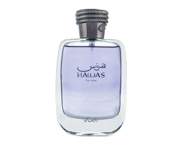
                        <img src="img/perfume/23df411056b59a0db0b5a11a272f9890.jpg" alt="Jean Lowe Fantasme Maison Alhambra">
                    </div>
                    <div class="product-info mt-20">
                        <h4>Rasasi Hawas</h4>
                        <p>Rasai</p>
                        <p class="price">R750,00</p>
                        <p>100ml</p>
                    </div>
                </div>
            </div>
            </a>
              <!-- Single Product -->
            <div class="col-6 col-md-4 col-lg-3">
                <a href="rooms5.html"> <div class="single-product text-center mb-100">
                    <div class="product-img">
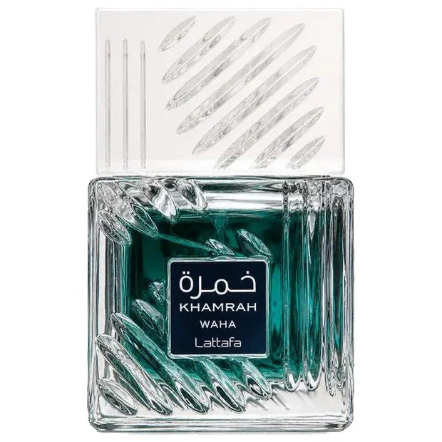
                        <img src="img/perfume/social.132409.webp" alt="Jean Lowe Fantasme Maison Alhambra">
                    </div>
                    <div class="product-info mt-20">
                        <h4>Khamrah Waha</h4>
                        <p>Lattafa Perfumes</p>
                        <p class="price">R700,00</p>
                        <p>100ml</p>
                    </div>
                </div>
            </div>
            </a>
    <!-- Single Product -->
            <div class="col-6 col-md-4 col-lg-3">
              <a href="rooms10.html"> <div class="single-product text-center mb-100">
                    <div class="product-img">
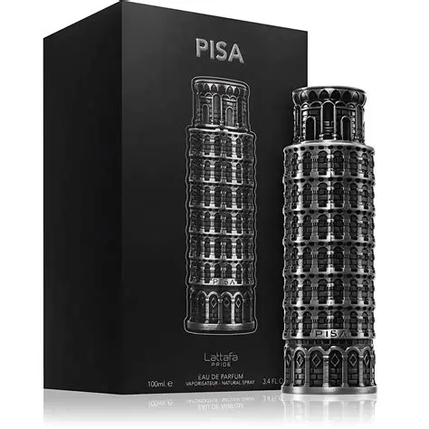
                        <img src="img/perfume/bbb.webp" alt="Jean Lowe Fantasme Maison Alhambra">
                    </div>
                    <div class="product-info mt-20">
                        <h4>Pisa</h4>
                        <p>Lattafa Perfumes</p>
                        <p class="price">R750,00</p>
                        <p>100ml</p>
                    </div>
                </div>
            </div>
        </a>
              <!-- Single Product -->
            <div class="col-6 col-md-4 col-lg-3">
              <a href="rooms13.html">  <div class="single-product text-center mb-100">
                    <div class="product-img">
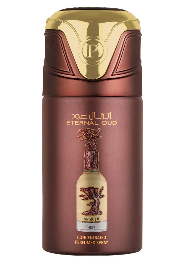
                        <img src="img/perfume/jjjj.jpg" alt="Jean Lowe Fantasme Maison Alhambra">
                    </div>
                    <div class="product-info mt-20">
                        <h4>Eternal Oud</h4>
                        <p>Lattafa Perfumes</p>
                        <p class="price"> R750,00</p>
                        <p>100ml</p>
                    </div>
                </div>
            </div>
        </a>
           <!-- Single Product -->
            <div class="col-6 col-md-4 col-lg-3">
              <a href="rooms10.html"> <div class="single-product text-center mb-100">
                    <div class="product-img">
                        <img src="img/perfume/jin.jpg" alt="Jean Lowe Fantasme Maison Alhambra">
                    </div>
                    <div class="product-info mt-20">
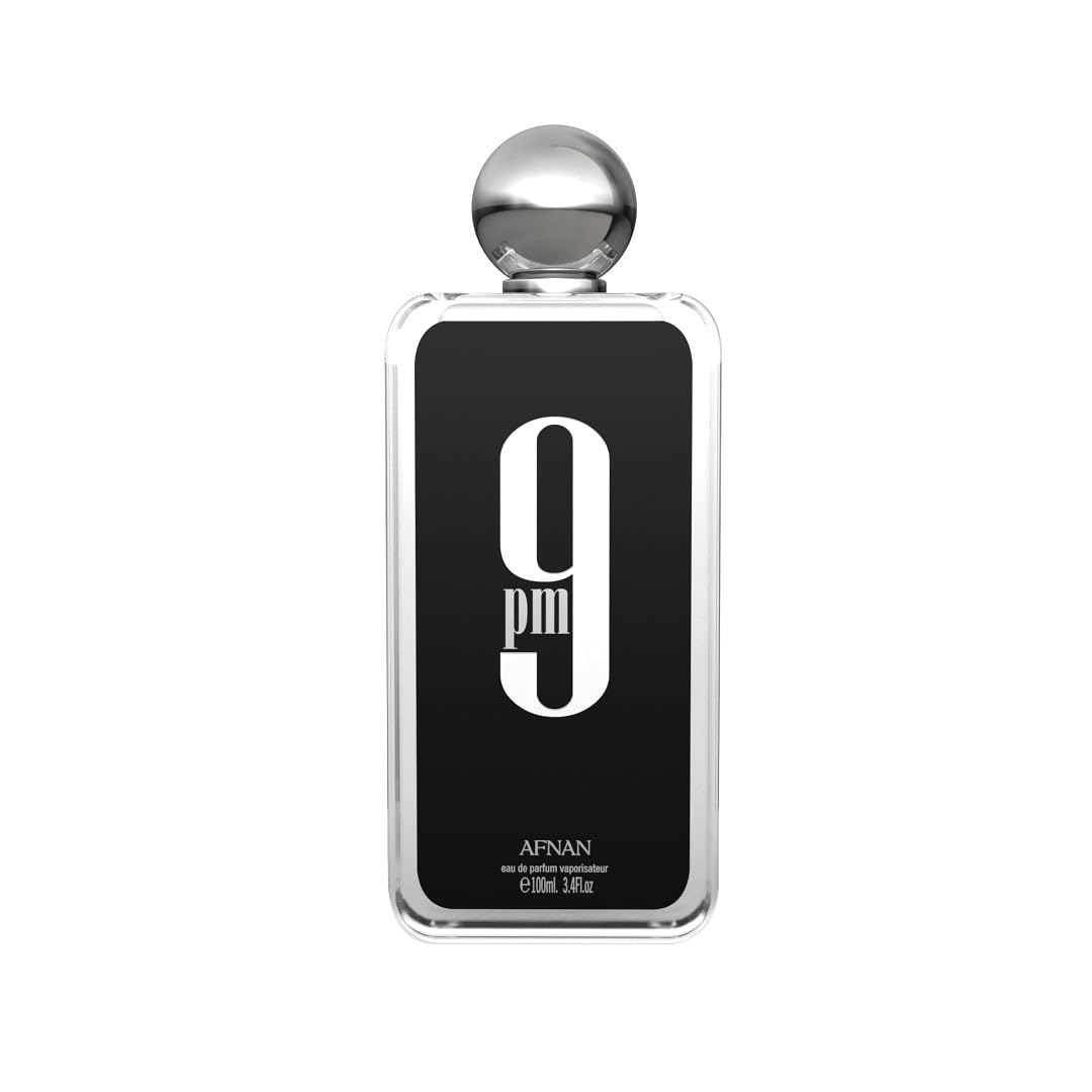
                        <h4>9PM</h4>
                        <p>Afnan Perfumes</p>
                        <p class="price">R650,00</p>
                        <p>100ml</p>
                    </div>
                </div>
            </div>
        </a>
              <!-- Single Product -->
            <div class="col-6 col-md-4 col-lg-3">
              <a href="rooms13.html">  <div class="single-product text-center mb-100">
                    <div class="product-img">
                        <img src="img/perfume/maison.jpg" alt="Jean Lowe Fantasme Maison Alhambra">
                    </div>
                    <div class="product-info mt-20">
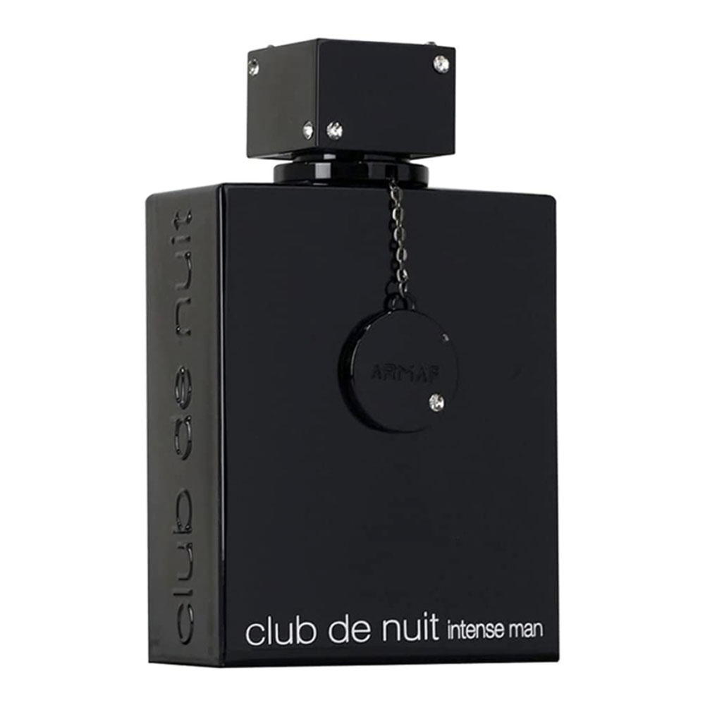
                        <h4>Club de Nuit Intense</h4>
                        <p>Armaf</p>
                        <p class="price"> R650,00</p>
                        <p>100ml</p>
                    </div>
                </div>
            </div>
        </a>
 
        </div>
    </div>
</section>
<!-- ##### Perfume Grid Area End ##### -->